
The Challenge
Mission College was founded in 1975 and is located in the middle of Silicon Valley. Their motto is “Where today’s students meet tomorrow’s opportunity.” The college offers a broad base of courses including graphic design and multimedia, computer technology, hospitality management, health occupations, and fire prevention.
Each group was given the challenge to develop a promotional poster that would promote the college’s Graphic Design and Multimedia Department. Our group
(Rita Gandhi, Bharti Rajoriya and Sean Totanes) focused on creating visual design that was inspired by the brand’s healthy core attributes.
The assignment began as a group exercise but would evolve into individual designs by each person. The Advanced Photoshop instructor, Gokce Kasikci-Ata, was the art director for this project.
Audience and Opportunity
Research into the college and university industry with a focus on generation Z (ages 7-21), provided insight into the audience and the market in general. Our main audience were more likely to engage in brands who understand them as an assortment of entrepreneurs, inventors and activists. They are looking to attend a college that offers the degrees that truly matter in the specific career they picture themselves in, without going into mounds of debt.
Inspiring Action
Focused on our audience and their needs, we came up with the slogan “Design your dreams into reality.” Our thinking was to speak to those entrepreneurs, creatives, and future graphic designers to imagine their dreams becoming reality in the same way a sketch comes to life on a sketch pad. This simple and impactful message was thoughtfully woven into the design.
The Design Process
Taking our research, I started to sketch a few ideas. The first design was a quirky idea that communicated a graphic design degree as a health drink. In place of nutritional facts where attributes of the degree and school.


The second was inspired by the word “dream” in the slogan “Design your dreams into reality.” The goal was to capture the imagination of the viewer and draw them into a world where their dreams where being fulfilled. I also wanted to show the creativity and technical skill that the college offers future graphic design students.


After creating a working mock-up I showed it to a few colleagues, middle school and high school students and received insightful feedback. The design was not communicating the message clearly or capturing the audience.
Going back to our brainstorming notes, doing more research and thinking about our audience, I redesigned the poster.
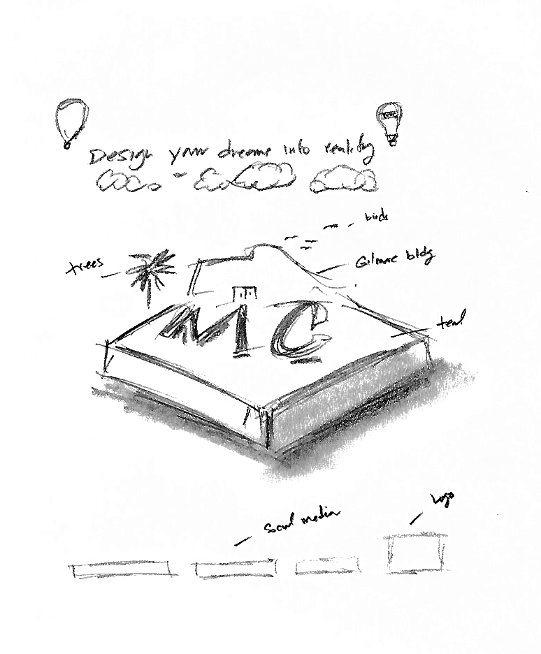
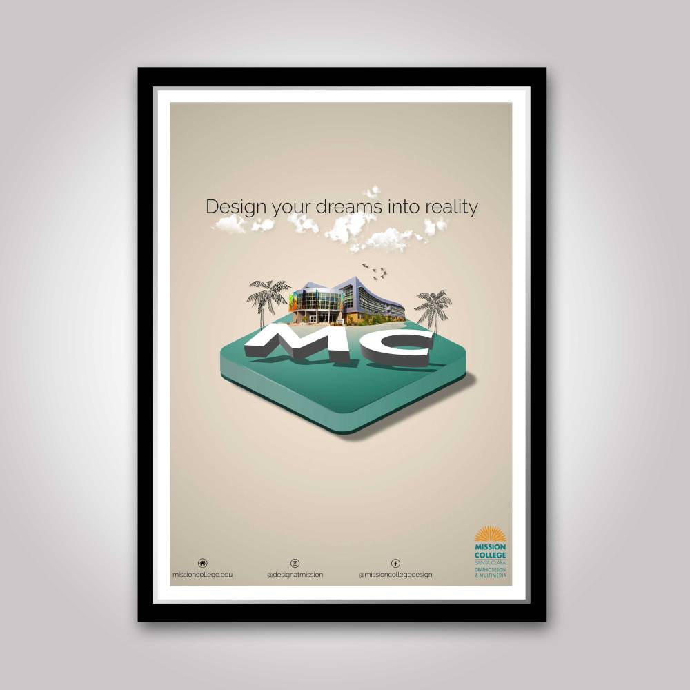
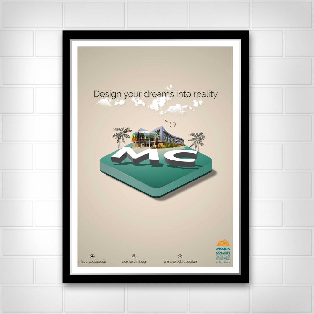
The third visual design concept is created on a 6×12 grid focused on better communicating Mission College as a place where your dreams can become a reality.
To grab the attention of the viewer, to communicate the strength, consistency, and integrity of the college, and to keep consistent with the brand colors, a teal tile is sitting in the center of the design.
The tile is to communicate three specific ideas about the college: it is a special place in Silicon Valley, it possess cutting edge resources, and the staff and students strive for modern and
forward design.
To convey a positive and light feeling, hovering over the tile are the letters “MC.”
The abbreviated design of the name was to help viewers relate and move through the design quickly. The typeface Futura was chosen to stay consistent with the brand.White was chosen for the large letters to help the letters pop and have a crisp look.
 To communicate the creative and relaxed environment of the college, two hand-drawn palm trees are placed hugging the letters “MC.” These palm trees also symbolize the journey of discipline and success that a Mission College student experiences.
 A symbol of innovation at Mission College is the three story, 112,000 ft Gilmore Building. Placing the building at the center of the project rising up towards the clouds was intended to give a sense of “awe” and to give a visual of where future students would attend classes. The teal tile also acts as a welcome mat into a future home for graphic design and multimedia students.
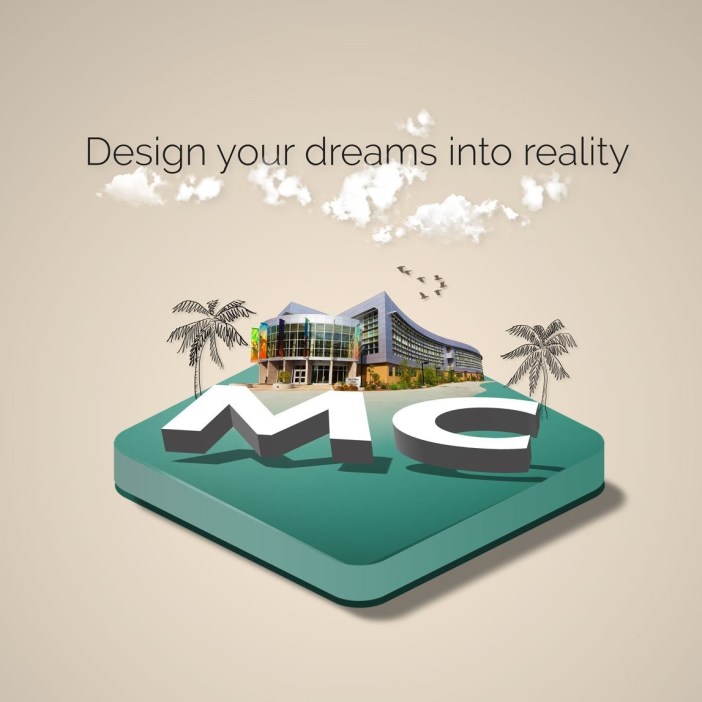
A silhouette of birds flying was placed moving from the left to the right of the page to give a sense of freedom, community and a new perspective on college education. It also helps the viewer move their attention up into the clouds and into the slogan.
The image of the dispersed clouds was incorporated into the design to symbolize dreams yet to be fulfilled and creativity and innovation that the school possess. They are also to support the feeling that is light and welcoming.
Acting as a backdrop to the design is a gradient cream background. The color offers warmth of the color of brown and the cool and cleanness of white. It also communicates the sophistication, durability and economical attributes of the college.
The slogan “Design your dreams into reality,” is the culmination of the design. To communicate the message clearly, the sans-serif font Raleway was chosen due to its elegant and strong lines. The saturated dark-gray color
was chosen to help the viewer easily read and capture
the message.
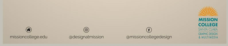
The call to action is for the audience to discover more about the college through social media resources. The negative space below the teal tile acts as a visual directive for the viewer to move down to the social media address. The Mission College logo is in the lower right corner to communicate who created the poster and which college should be explored.

To further differentiate Mission College and continue this design I would craft a strong digital presence with powerful images and animation.
Challenges
The main challenge of this project was keeping it as simple as possible while clearly conveying the desired message to the intended audience. There were times when I wanted to add more items on the tile, more movement, or more words. In those times I would remember what someone told me,
“If the project can stand without the element, then leave it out.”
Lessons Learned
This design project has taught me to let go of ideas that are not producing the best results and to advance towards new ideas that will. I have learned the value of receiving feedback from the target market and from seasoned graphic designers.
I also discovered a great satisfaction knowing that the design I help develop will help future students bring their dreams into reality.
Was it Successful?
Yes, I believe we accomplished our goal! We developed an eye catching poster that promotes the Graphic design and Multimedia Department at Mission College through a unified design of images, color, movement and texture while staying within the brand’s attributes.
The art director was pleased with the final design. After showing the redesigned poster to the same group of middle school and high school students they liked the new design and found it to be,
“cool” and “creative.”
I recently had the opportunity to showcase my design at a Mission College Open House directed at future students and their families. My instructor used this poster, printed full-color at 18” x 24”, to draw attention to the Graphic Design department during the event.

Leave a comment